CBC/Radio-Canada is Canada's national public broadcaster. Their mandate is to inform, enlighten and entertain, in order to strengthen Canadian culture on radio, television and digital platforms.
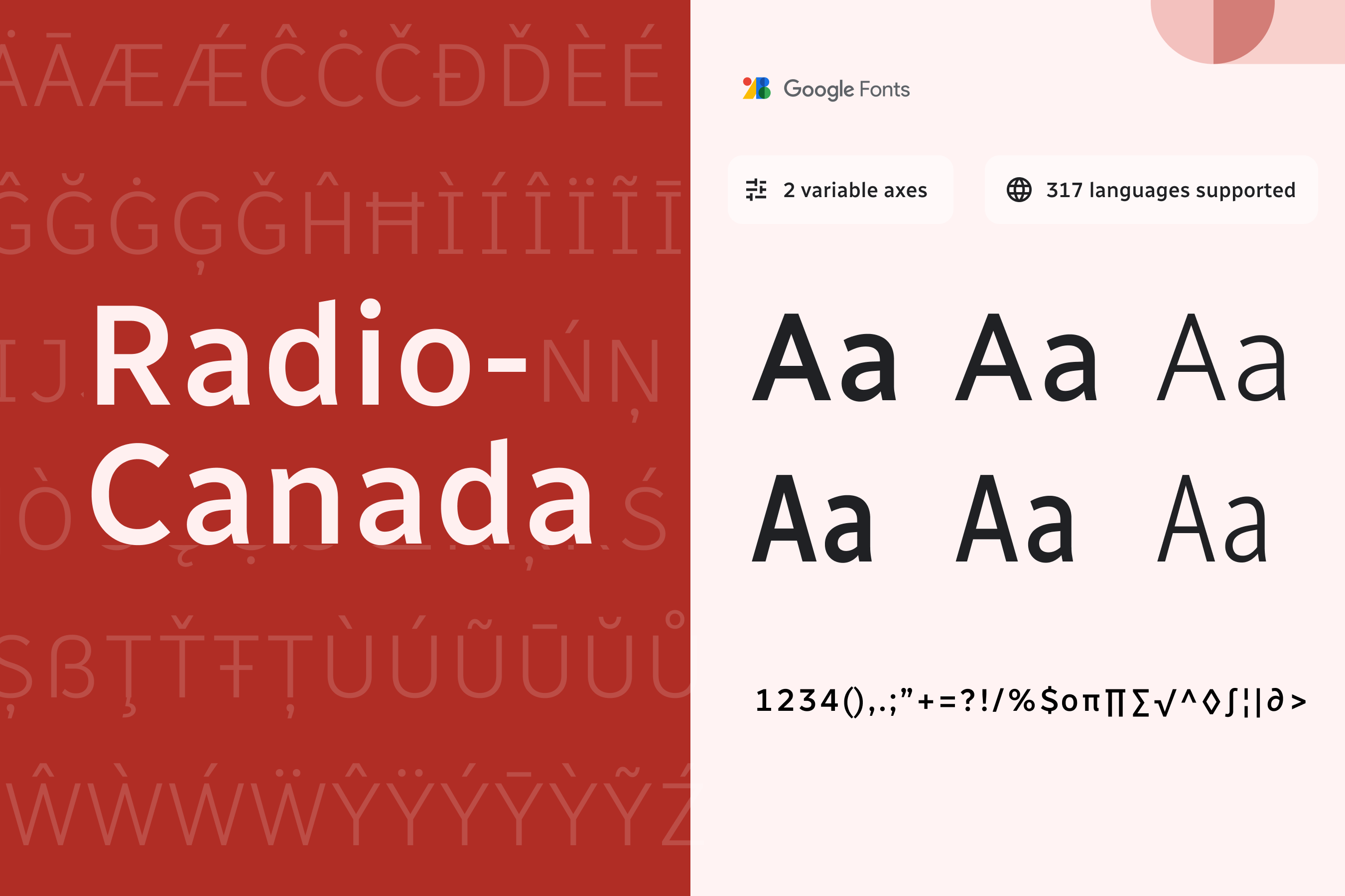
The Radio-Canada font was created in 2017 by Montreal-based designer and typographer Charles Daoud, in collaboration with Coppers and Brasses and Alexandre Saumier Demers. It was designed specifically for CBC/Radio-Canada as a brand unifying information font for all the Public Broadcaster’s platforms. Fittingly, for a Public Broadcaster, this is a peoples’ font and the humanistic style stands out with distinctive angles and subtle curves. Its x-height ensures excellent legibility and respects digital accessibility standards, making it very effective when used in continuous text.
In 2018, the Radio-Canada font won three awards, in the Font Design category at Communication Arts Typography, Applied Arts Design Annual and at Grand Prix Grafika.
Several optimizations saw the light of day in 2021. The number of supported languages has increased from 106 to 317 Latin languages. In 2022, Jacques Le Bailly (Baron von Fonthausen) expanded the font to include the support of Indigenous languages
To contribute, see github.com/cbcrc/radiocanadafonts.
A typeface made to give a specific identity and distinction to the Canadian Broadcasting Corporation (CBC) and Radio-Canada’s public broadcasting platforms is now available on Google Fonts in many languages using the Latin writing system, including many indigenous languages spoken in Canada.
CBC/Radio-Canada is Canada's national public broadcaster. Its mandate is to inform, enlighten, entertain, and strengthen Canadian culture and diversity on radio, television, and digital platforms. As part of this mandate, CBC/Radio-Canada is proud to release its original typeface publicly and make it available through Google Fonts.
The Radio-Canada typeface was created in 2017 by Montreal-based designer and typographer Charles Daoud, in collaboration with Coppers and Brasses and Alexandre Saumier Demers.
The humanist style stands out with distinctive angles and subtle curves. In compliance with digital accessibility standards, the font’s x-height is intended to increase legibility, making it very effective when used in continuous text.
To learn more, read:
You can now use Radio-Canada’s brand typeface: The award-winning variable font comes to Google Fonts (English)
Voici Radio-Canada, la police de caractères du diffuseur public canadien, plusieurs fois primée et maintenant disponible sur Google Fonts (French)