Lexend fonts are intended to reduce visual stress and so improve reading performance. Initially they were designed with dyslexia and struggling readers in mind, but Bonnie Shaver-Troup, creator of the Lexend project, soon found out that these fonts are also great for everyone else.
The first set of Lexend fonts by Thomas Jockin ( Deca, Exa, Giga, Mega, Peta, Tera, Zetta) becomes wider and more openly spaced (also known as "tracked out"). This new version of Lexend is a variable font with a weight axis.
Please note that the initial release of this font had a lighter Regular weight. It has been decided for the update of July 2021 to align the Regular weight with the one of Lexend Deca which is slightly bolder. Lexend and Lexend Deca are therefore the same (for now…). Ultimately this version will offer a HyperExpansion axis which will allow variation of inner and outer space of letterforms.
True to Bonnie’s vision, Lexend fonts are freely available for all since 2019 in Google Fonts.
To contribute, see github.com/googlefonts/lexend. For more information, see lexend.com.
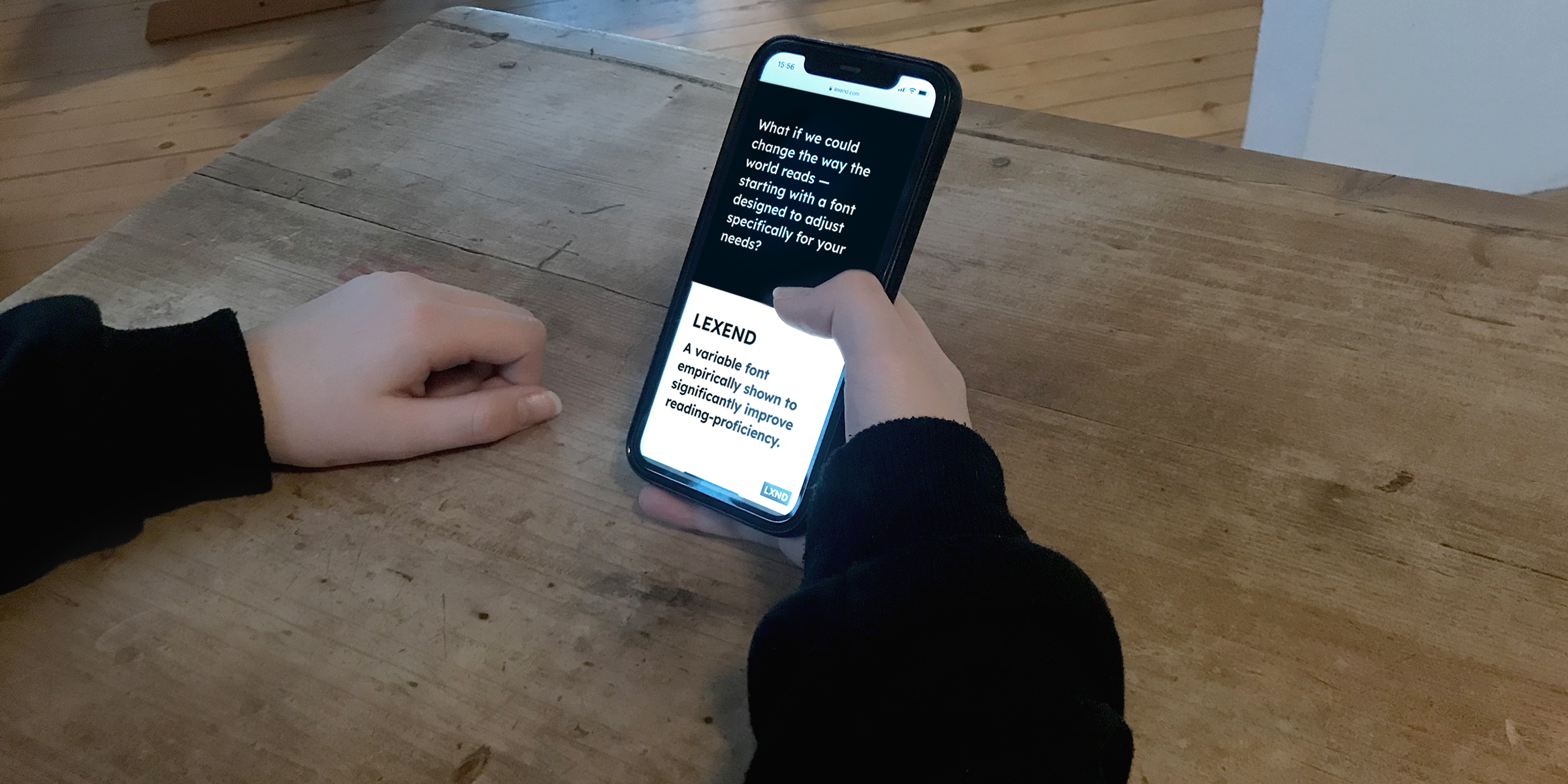
A key factor in reading problems might be hiding in plain sight. Learn how changing fonts can change comprehension.
A child struggles to read and understand their homework assignment. An adult re-reads a news article and still doesn’t understand what it’s about. Both readers end up frustrated and feeling like there is something wrong with them. Thankfully there might be a simple answer. Dr. Bonnie Shaver-Troup thinks fonts are part of the problem and the solution to many reading problems.
“We have a global reading crisis and we can change much of it by delivering fonts that are optimized for the visual field and for the individual. The answer is hidden in plain sight. It’s the font,” said Shaver-Troup.
While working as an educational therapist in Silicon Valley, Shaver-Troup helped students with dyslexia and other reading problems to learn to read. She experimented by changing the spacing between certain letters in their reading assignments, and found that it improved their reading and comprehension. According to Shaver-Troup, the issue wasn’t in her students’ minds, it was with the letterforms they saw on the screen or paper.
“The majority of the reading problems, including dyslexia, are not cognitive or phonological. They are visual or perceptual. Our testing has a built-in design flaw. We use fonts to deliver text for reading that are too tight for efficient or successful visual processing. Then we get poor results, suggesting the reading issue is phonological or cognitive. If we change the font to the tested optimized font fit, then we change the outcome,” she explained.
To learn more, read:
Clean and clear: making reading easier with Lexend (English)
Partnering to change how the world reads (English)
Eine Partnerschaft mit dem Ziel, das Leseerlebnis weltweit zu verändern: Erweiterung von Lexend um verschiedene Schriftstärken (German)