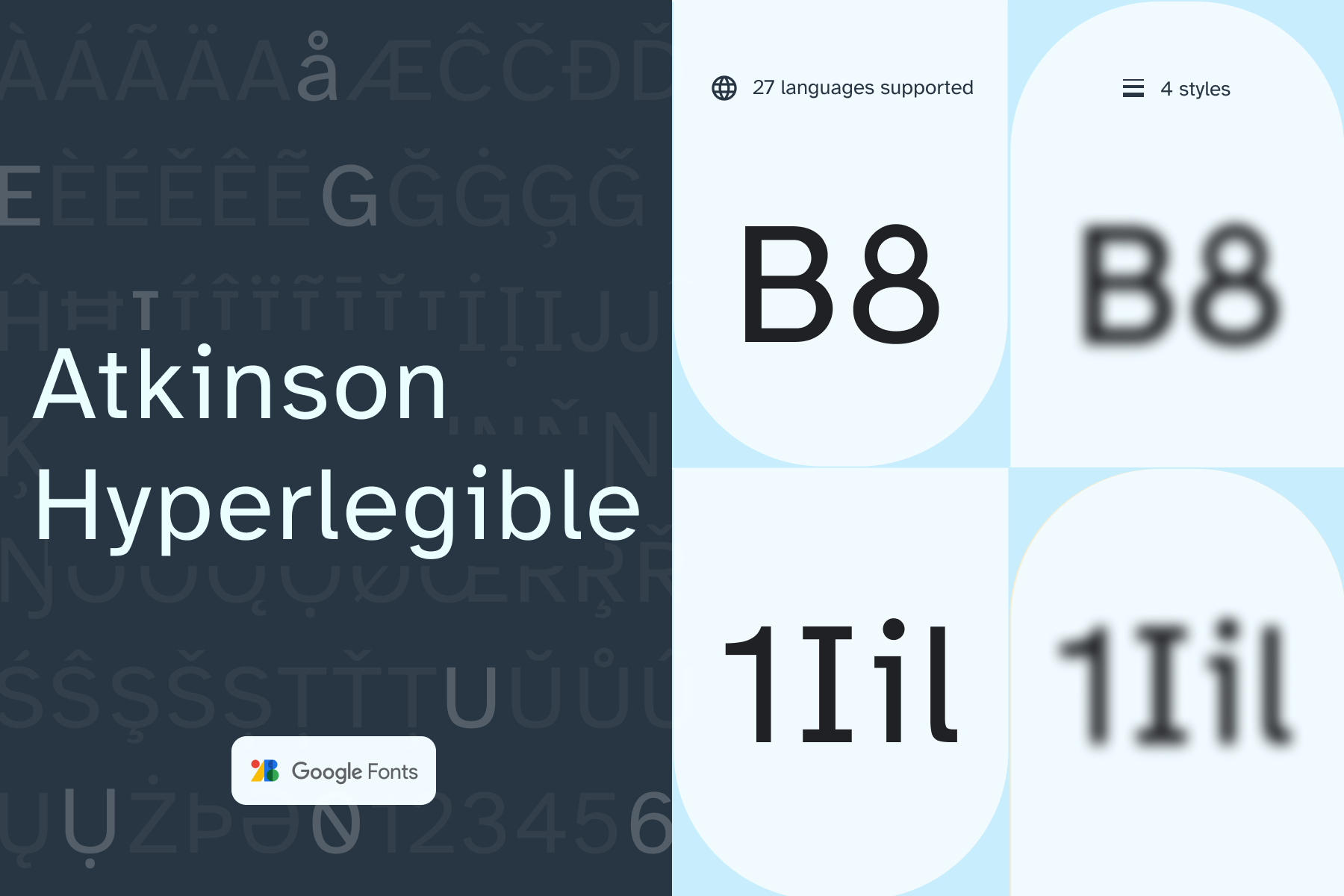
Atkinson Hyperlegible, named after the founder of the Braille Institute, has been developed specifically to increase legibility for readers with low vision, and to improve comprehension.
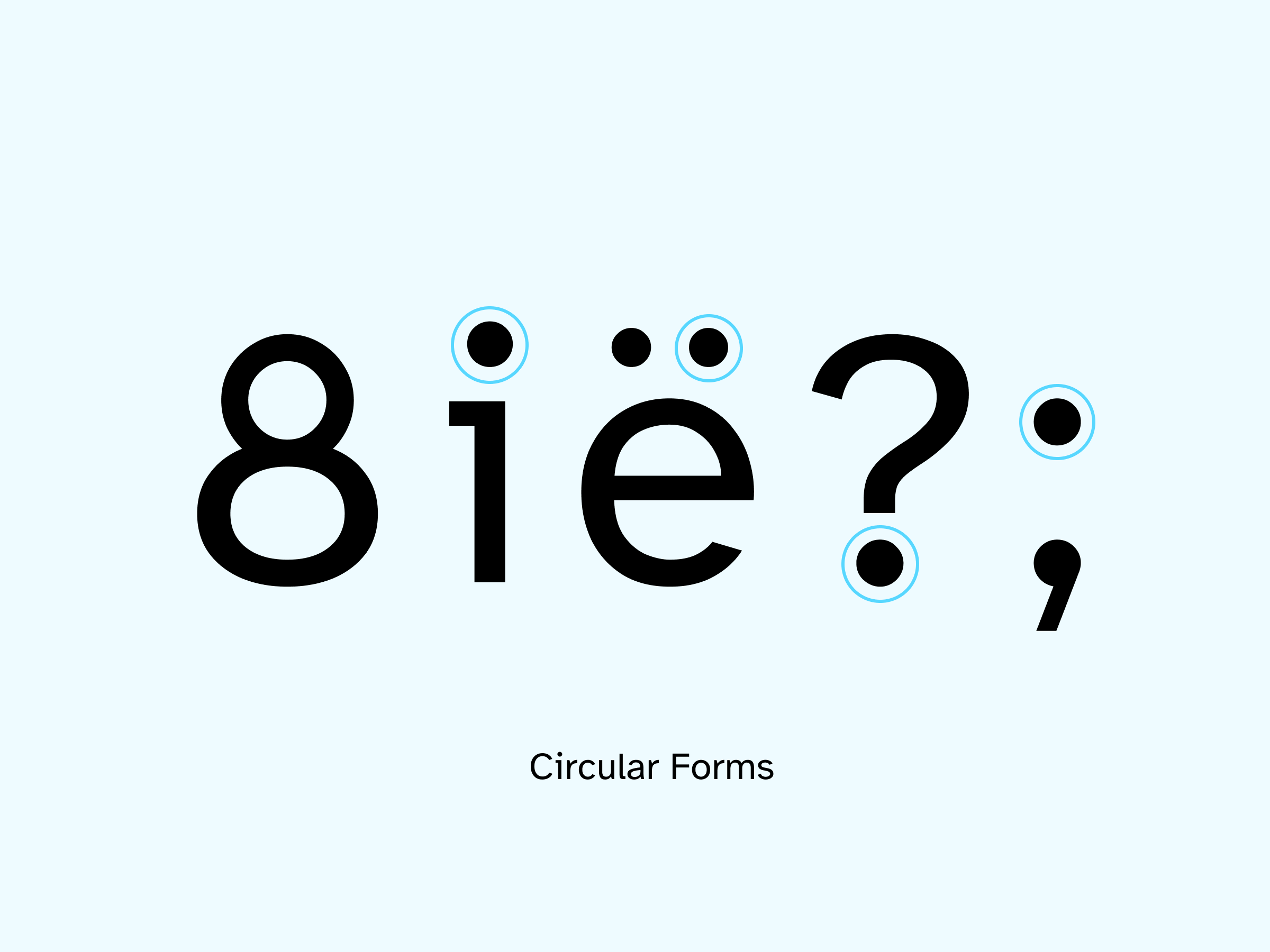
Having a traditional grotesque sans-serif at its core, it departs from tradition to incorporate unambiguous, distinctive elements—and at times, unexpected forms—always with the goal of increasing character recognition and ultimately improve reading.
To contribute, see github.com/googlefonts/atkinson-hyperlegible.
According to the World Health Organization (WHO), at least 2.2 billion people have a vision impairment. Major financial burdens can occur when people can’t read fluently or work to their full potential. For example, the WHO estimates that “losses associated with vision impairment from uncorrected myopia and presbyopia alone were estimated to be US$ 244 billion and US$ 25.4 billion, respectively.” Typeface design can help.
When Braille Institute hired Applied Design Works to create a new brand identity and branding strategy to coincide with their 2019 centennial anniversary, the firm looked for a beautiful and functional font specifically designed for improved legibility and readability. Brad Scott and Elliott Scott of Applied Design Works were concerned about typefaces that look a little like old ransom notes, where each letter and number were dramatically different from each other. They wondered if, despite designers’ intentions, these typefaces could actually be more difficult to read for some people. They decided that no existing typeface met their legibility, readability, and branding goals. So they endeavored to create a new typeface called Atkinson Hyperlegible, named after the organization’s founder J. Robert Atkinson. The work would go on to be recognized with a 2019 Fast Company ‘Innovation by Design’ Award.
To learn more, visit From Rebranding to Readability with Atkinson Hyperlegible.